Metrics Reference
This page explains the metrics supported by WisDM Metrics Dashboards, including what each metric means, how to interpret its value, and which operation and widget type are recommended.
Use this page when you need to:
- Check what a metric represents.
- Understand the unit and value meaning of a metric.
- Choose a suitable operation, such as
SUM,COUNT,AVG,MAX,MIN, orLAST VALUE. - Decide whether a metric is suitable for a chart, table, single value, or dashboard template.
- Confirm whether a metric is suitable for your monitoring or troubleshooting scenario.
-
For ready-to-use dashboard templates, see Metrics Dashboard Examples.
-
For configuration steps, see Configure Metrics Dashboards.
Widget Types
A widget type determines how calculated metric results are presented. The displayed result also depends on the selected metric, operation, time range, and filters.
| Widget Type | Best Used For |
|---|---|
| Single value | Highlighting one summarized metric result or status count. |
| Line chart | Reviewing continuous metric trends over time. |
| Bar chart | Comparing metric values across discrete time intervals. |
| Stacked bar chart | Comparing related metrics, their composition, and total. |
| Area chart | Reviewing trends while emphasizing data volume or magnitude. |
| Pie chart | Showing how related metric results contribute to a total. |
| Table view | Comparing, filtering, or ranking metric results by gateway. |
Single Value
Use a Single value widget to highlight one summarized metric result, such as the number of online gateways or the latest value of a selected metric.
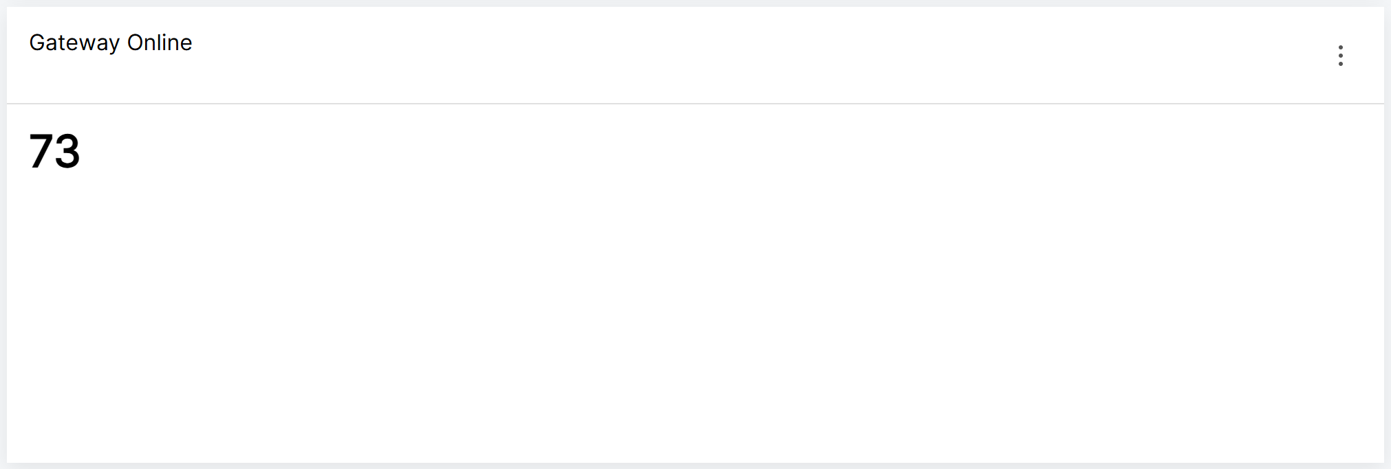 Figure 1: Single Value Widget
Line Chart
Use a Line chart to review how a metric changes over time. It is best suited for continuous trend analysis, such as CPU utilization, available memory, or gateway uptime.
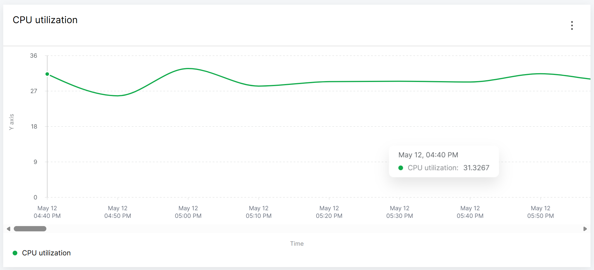 Figure 1: Line Chart Widget
Bar Chart
Use a Bar chart to compare metric values across discrete time intervals. It makes differences between individual time buckets easier to identify.
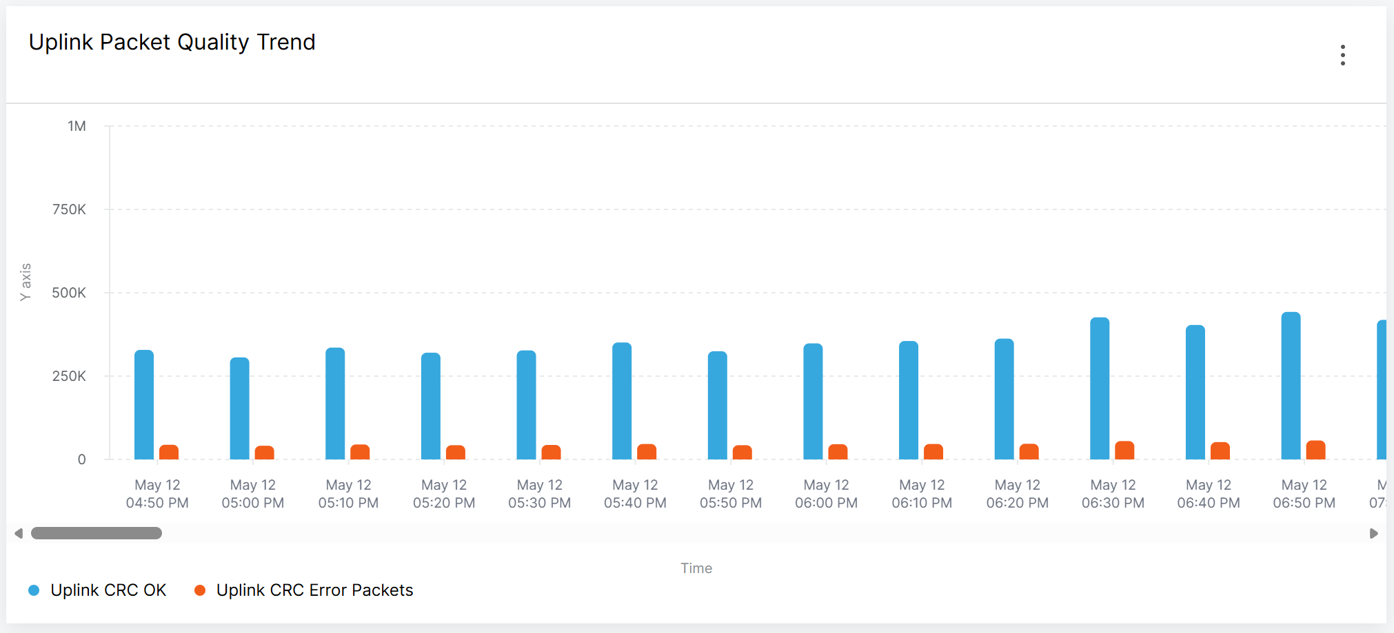 Figure 1: Bar Chart Widget
Stacked Bar Chart
Use a Stacked bar chart to compare multiple related metrics within each time interval. It shows both the combined total and the contribution of each metric.
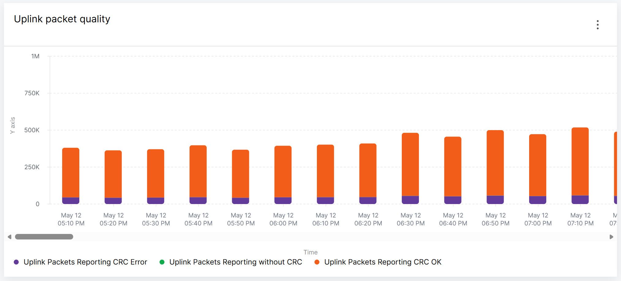 Figure 1: Stacked Bar Chart Widget
Area Chart
Use an Area chart to review trends while emphasizing the volume or magnitude of metric changes. It is suitable for traffic, packet volume, and resource usage metrics.
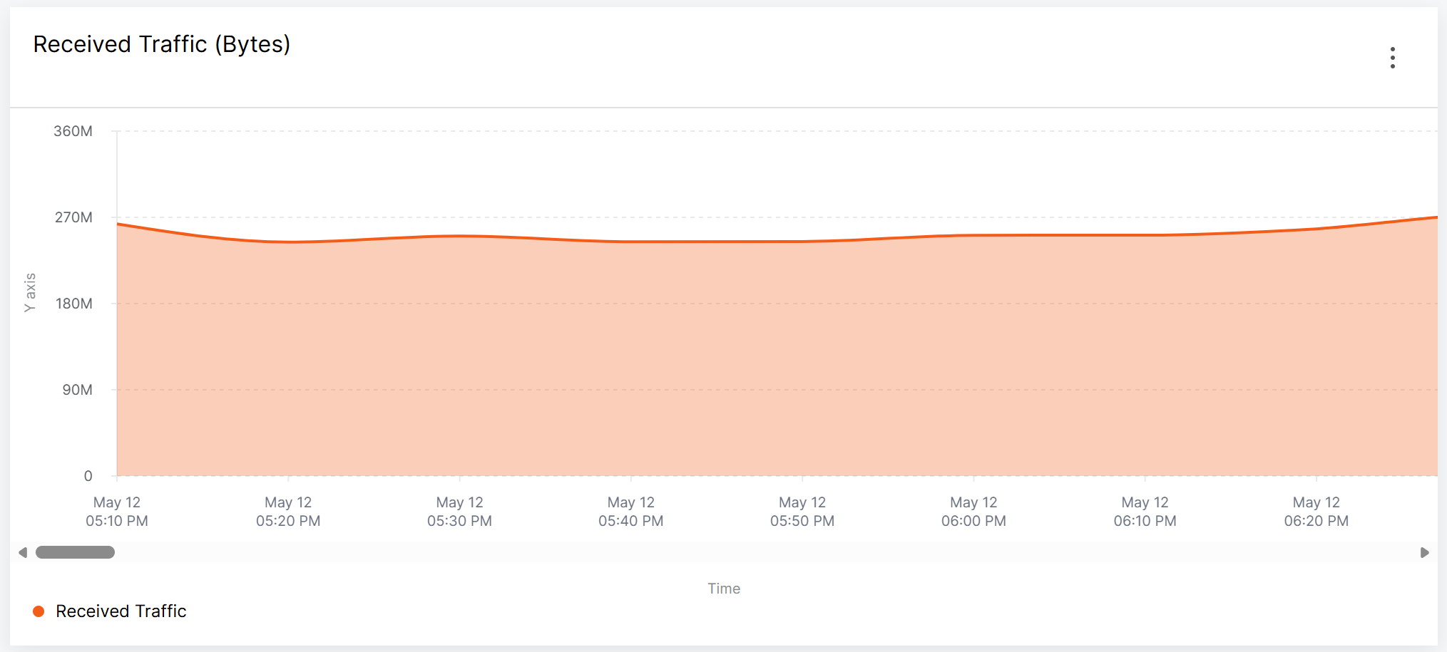 Figure 1: Area Chart Widget
Pie Chart
Use a Pie chart to show how multiple related metric results contribute to a total. It is suitable for distributions such as gateway status or active WAN interface usage.
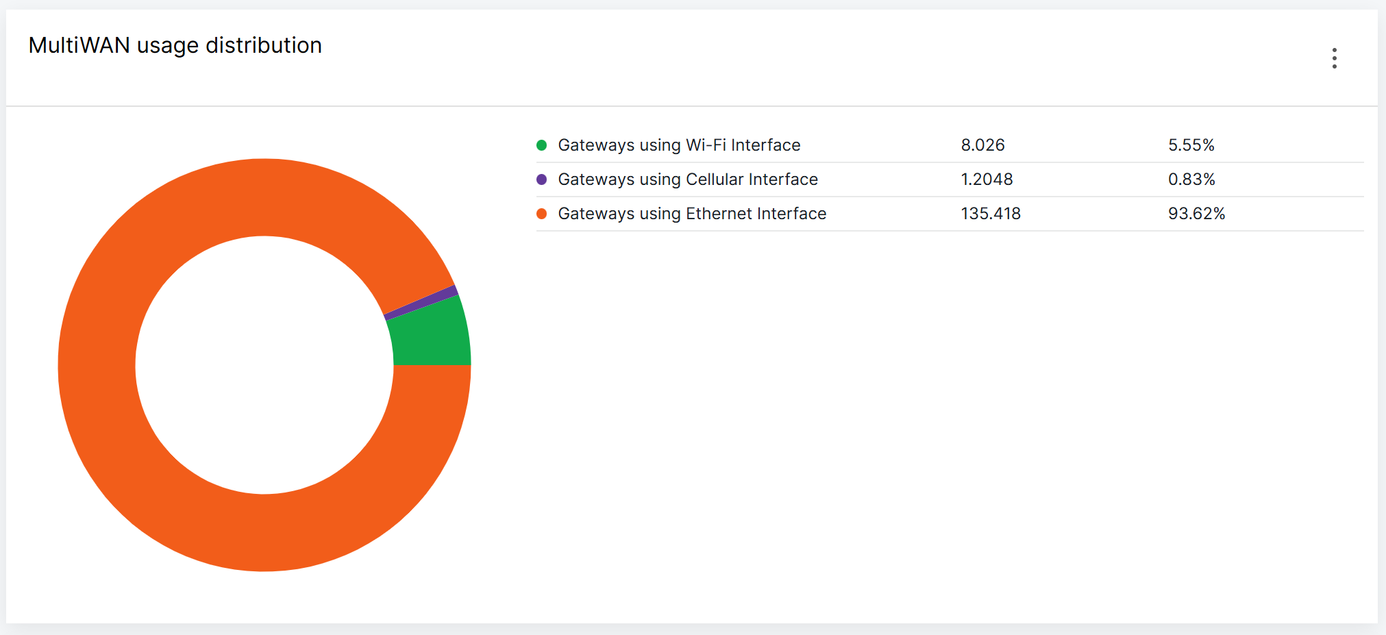 Figure 1: Pie Chart Widget
Table View
Use a Table view to display calculated metric results separately for each gateway. It is best suited for identifying, filtering, comparing, or ranking gateways with specific statuses or abnormal values.
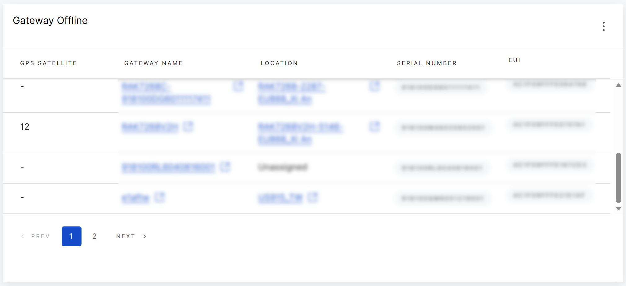 Figure 1: Table Widget
Metrics by Category
The following sections describe WisDM Metrics by category, including what each metric means, how to interpret its value, and how to use it in widgets.
WisDM records metric data for each gateway at approximately 10-minute intervals.
Metric results depend on the selected time range, filters, widget type, and operation.
System
System metrics help you check gateway status, reboot detection, lifecycle events, and runtime stability.
| Metric | Unit | What It Tells You | Recommended Use |
|---|---|---|---|
| Gateway Count | Count | Shows the gateway count in each status in WisDM. Supported count values include 1 = Offline, 2 = Online, 3 = Provisioning, and 4 = PreProvisioning. This metric helps you review gateway status distribution and identify how many gateways are currently in each state. | Use LAST VALUE + Single value to show the latest count of gateways in a specific status, such as Online or Offline. Use LAST VALUE + Pie chart to show the latest distribution of gateways across different statuses. |
| System Uptime | Time | Shows how long a gateway has been running since the last startup. A sudden drop usually means the gateway restarted. | Use MIN + Table view to find gateways with low uptime. Use AVG + Line chart for uptime trend review. |
| Gateway Rebooted | — | Reports the reboot state of each gateway at each reporting interval. If a gateway's uptime is less than 10 minutes, the value is 1 = Reboot detected. Otherwise, the value is 0 = Stable . | Use LAST VALUE + Single value or LAST VALUE + Bar/Line chart with the filter Gateway Rebooted = Reboot detected to show how many gateways had a reboot detected within the selected time range or time bucket. |
| OTA State | — | Reports the OTA state of each gateway at each reporting interval. Supported values are:
| Use COUNT + Line/Bar chart with the filter OTA State = Error to monitor how often OTA error states are reported over time. |
In addition to the Gateway Count values, the widget configuration allows other gateway attributes and reported metrics to be used as filter labels.
For example, you can use Gateway Count + LAST VALUE with filters such as:
- Gateway Rebooted = Reboot detected to show the latest number of gateways with a recent reboot detected.
- OTA State = Error to show the latest number of gateways reporting an OTA error.
- Network Failover = Failover detected to show the latest number of gateways reporting network failover.
- CPU Utilization > 80% to show the latest number of gateways reporting high CPU usage.
- Available Memory < a selected threshold to show the latest number of gateways reporting low available memory.
These fields may also be available as independent metrics. Use the independent metric when you want to analyze its value or trend directly. Use it as a filter with Gateway Status when you want to count gateways that match the selected condition.
CPU and Memory Utilization
CPU and memory metrics help you identify gateways under resource pressure.
| Metric | Unit | What It Tells You | Recommended Use |
|---|---|---|---|
| CPU Utilization | % | Shows gateway CPU usage. A higher value means heavier CPU load. | Use AVG + Line chart to review CPU usage trends over time. Use MAX + Table view with a filter such as CPU Utilization > 80% to identify gateways that experienced high CPU usage during the selected time range. |
| Available Memory | Storage | Shows available gateway memory. A lower value may indicate memory pressure. | Use AVG + Line chart to review memory availability trends. Use MIN + Table view with a filter such as Available Memory < the expected baseline to identify gateways that experienced low available memory. |
| Available Storage % | % | Shows the percentage of available SD card storage. A lower value means less remaining storage space for logs, cached data, or local files. | Use LAST VALUE + Table view with a short time range and a filter such as Available Storage % < 20% to identify gateways that are currently or recently reporting low available storage. |
Network Interface — Cellular Connectivity
Cellular metrics help you review cellular link availability and signal quality.
| Metric | Unit | What It Tells You | Recommended Use |
|---|---|---|---|
| Cellular Link Status | — | Reports cellular link status. 0 = Cellular disconnected and 1 = Cellular connected. Gateways without a cellular module usually do not report this metric. | Use LAST VALUE + Table view to find gateways currently or recently reporting cellular disconnection. |
| Cellular Signal | Signal level | Reports cellular signal level. 0 = No signal, 1 = Poor, 2 = Fair, 3 = Good, and 4 = Excellent. 0 means no signal, but it does not necessarily mean the cellular link is disconnected. | Use MIN + Table view to find gateways that had weak signal during the selected time range. Use LAST VALUE + Table view to check each gateway's latest cellular signal level. |
Network Interface — MultiWAN
MultiWAN metrics help you understand which WAN interface is active.
| Metric | Unit | What It Tells You | Recommended Use |
|---|---|---|---|
| Gateways Using Ethernet Interface | — | Shows whether Ethernet is the active WAN interface. 1 = Ethernet is active, 0 = Ethernet is not active. | Use LAST VALUE + Table view with an active filter to identify gateways currently or recently using Ethernet as the active WAN interface. |
| Gateways Using WiFi Interface | — | Shows whether Wi-Fi is the active WAN interface. 1 = Wi-Fi is active, 0 = Wi-Fi is not active. | Use LAST VALUE + Table view with an active filter to identify gateways currently or recently using Wi-Fi as the active WAN interface. |
| Gateways Using Cellular Interface | — | Shows whether Cellular is the active WAN interface. 1 = Cellular is active, 0 = Cellular is not active. | Use LAST VALUE + Table view with an active filter to identify gateways currently or recently using Cellular as the active WAN interface. This is useful for reviewing failover behavior and cellular usage risk. |
Network Interface
Traffic and interface runtime metrics help you review backhaul traffic and interface stability.
| Metric | Unit | What It Tells You | Recommended Use |
|---|---|---|---|
| Cellular Uptime | Time | Shows how long the cellular interface has stayed connected since the last cellular connection. Gateways without a cellular module usually do not report this metric. | Use LAST VALUE + Table view to check the latest cellular connection runtime for each gateway. Use MIN + Table view to find gateways whose cellular link recently reconnected during the selected time range. Use a filter such as Cellular Uptime < 3600 to focus on gateways with short cellular uptime. |
| Ethernet Uptime | Time | Shows how long the Ethernet interface has stayed connected since the last Ethernet connection. | Use LAST VALUE + Table view to check the latest Ethernet connection runtime for each gateway. Use MIN + Table view to find gateways whose Ethernet link recently reconnected during the selected time range. Use a filter such as Ethernet Uptime < 3600 to focus on gateways with short Ethernet uptime. |
| WiFi Uptime | Time | Shows how long the Wi-Fi interface has stayed connected since the last Wi-Fi connection. | Use LAST VALUE + Table view to check the latest Wi-Fi connection runtime for each gateway. Use MIN + Table view to find gateways whose Wi-Fi link recently reconnected during the selected time range. Use a filter such as WiFi Uptime < 3600 to focus on gateways with short Wi-Fi uptime. |
| Network Failover | — | Reports the network failover state of each gateway at each reporting interval. Supported values are:
| Use COUNT + Line/Bar chart with the filter Network Failover = Failover detected to monitor how often failover states are reported over time. Use COUNT + Table view with the same filter to identify gateways that reported failover. |
| Received Traffic | Storage | Shows the amount of traffic received on the selected network interface. Use the Network Interface filter to review Ethernet, Wi-Fi, or Cellular traffic separately. | Use SUM + Line/Bar/Area chart to review received traffic trends over time. Use SUM + Table view to identify gateways with high received traffic. |
| Transmitted Traffic | Storage | Shows the amount of traffic transmitted through the selected network interface. Use the NetworkInterface filter to review Ethernet, Wi-Fi, or Cellular traffic separately. | Use SUM + Line/Bar/Area chart to review transmitted traffic trends over time. Use SUM + Table view to identify gateways with high transmitted traffic. |
| Interface Uptime | Time | Shows how long the selected network interface has stayed connected since the last interface connection. Use the Cellular Uptime, Ethernet Uptime, or WiFi Uptime filter to view each connection. | Use LAST VALUE + Table view to check the latest interface connection runtime for each gateway. Use MIN + Table view to find gateways or interfaces that recently reconnected during the selected time range. |
LoRaWAN® Packet Statistics
LoRaWAN packet statistics help you review uplink and downlink packet volume, uplink CRC quality, and downlink reporting results.
| Metric | Unit | What It Tells You | Recommended Use |
|---|---|---|---|
| Total Uplink Packets | Packets | Counts the total number of uplink packets reported by gateways within the selected time range. | Use SUM + Line/Bar chart to review uplink packet volume over time. Use SUM + Table view to identify gateways with high uplink packet volume. Use filters such as Total Uplink Packets > 0 or a higher threshold to focus on gateways or data points with uplink traffic. |
| Uplink Packets Reporting CRC OK | Packets | Counts uplink packets that passed CRC validation. | Use SUM + Stacked bar chart together with Uplink Packets Reporting CRC Error and Uplink Packets Without CRC to review uplink packet composition. Use SUM + Table view to identify gateways with high valid uplink packet volume. |
| Uplink Packets Reporting CRC Error | Packets | Counts uplink packets that failed CRC validation. A high error count may indicate RF interference, weak signal, antenna issues, poor gateway placement, or other radio environment problems. | Use SUM + Stacked bar chart together with Uplink Packets Reporting CRC OK to compare valid and failed uplink packets. Use SUM + Table view to locate gateways with high CRC error counts. |
| Uplink Packets Without CRC | Packets | Counts uplink packets that do not include CRC information. This traffic should be reviewed separately from CRC OK and CRC Error packets. | Use SUM + Line/Bar chart to review packets without CRC information over time. Use SUM + Table view to identify gateways reporting a high number of uplink packets without CRC information. |
| Total Downlink Packets | Packets | Counts the total number of downlink packets reported by gateways within the selected time range. This metric helps you understand overall downlink traffic volume. | Use SUM + Line/Bar chart to review downlink packet volume over time. Use SUM + Table view to identify gateways with high downlink packet volume. Use filters such as Total Downlink Packets > 0 or a higher threshold to focus on gateways or data points with downlink traffic. |
| Downlink Packets Reporting Success | Packets | Counts downlink packets successfully reported by the gateway. This helps you understand successful downlink reporting volume. | Use SUM + Stacked Bar chart together with Downlink Packets Reporting Error to review downlink reporting results. Use SUM + Table view to identify gateways with high successful downlink reporting volume. |
| Downlink Packets Reporting Error | Packets | Counts downlink packet reporting failures. A high error count may indicate gateway connectivity issues, scheduling issues, packet forwarder problems, or network server communication problems. | Use SUM + Stacked bar chart together with Downlink Packets Reporting Success to compare successful and failed downlink reporting. Use SUM + Table view to locate gateways with downlink reporting errors. Review this metric together with Total Downlink Packets to understand the error impact. |
GPS and Location
GPS metrics help you check GPS module state and satellite reception.
| Metric | Unit | What It Tells You | Recommended Use |
|---|---|---|---|
| GPS Status | — | Reports the GPS module state.
| Use LAST VALUE + Table view to check the latest GPS status of each gateway. Use filters such as GPS State != GPS locked with PPS output to focus on gateways that are not in the preferred GPS state. Use MAX + Table view to find gateways that reached high-value GPS problem states, such as GPS not locked or No GPS output detected, during the selected time range. |
| Observed GPS Satellites | Count | Shows the number of observed GPS satellites.
| Use LAST VALUE + Table view to check the latest satellite count of each gateway. Use MIN + Table view to find gateways that had weak or no satellite reception during the selected time range. |
Storage
Storage metrics help you check SD card availability and health.
| Metric | Unit | What It Tells You | Recommended Use |
|---|---|---|---|
| SD Card Status | — | Reports SD card status. 0 = Normal, 1 = SD card not detected, and 2 = SD card abnormal. | Use LAST VALUE + Table view to check the latest SD card status of each gateway. Use filters such as SD Card Status != Normal to focus on gateways with SD card issues. Use MAX + Table view to find gateways that reported SD card not detected or SD card abnormal during the selected time range. |
Metric Unit
A unit defines what the value represents.
For metrics with Time or Storage units, you can select a preferred display scale to present metric values in a format that best fits different monitoring scenarios.
| Unit | Available Display Scale |
|---|---|
| Time | Seconds, Minutes, Hours, Days, Months |
| Storage | Byte, KB, MB, GB |
Metric Operation
An operation defines how WisDM Metrics calculates metric values before displaying them in a widget.
Available Operations
| Operation | What It Does |
|---|---|
| COUNT | Counts how many data points match the selected metric, time range, and filters. It only counts the number of reported records. |
| SUM | Adds all metric values together within the selected calculation scope. |
| AVG | Calculates the average value from all matched data points. |
| MIN | Returns the lowest reported value from all matched data points. |
| MAX | Returns the highest reported value from all matched data points. |
| LAST VALUE | Returns the most recent available value. |
How Operations Are Calculated by Widget Type
For COUNT, SUM, AVG, MIN, and MAX, the calculation scope depends on the widget type.
| Widget Type | How the Operation Is Calculated |
|---|---|
| Bar Chart / Stacked Bar Chart / Area Chart / Line Chart | The operation is calculated for each time point on the chart. The default time step is 10 minutes, so each point shows the calculated value for that time bucket. |
| Pie Chart | The operation is calculated over the selected time range for each metric, and the result is shown as a percentage of the total. |
| Single Value | The operation is calculated once over the selected time range, and one result is displayed. |
| Table View | The operation is calculated separately for each gateway. Each gateway is displayed as one row in the table. |
How LAST VALUE Is Calculated
LAST VALUE is used to show the latest available value instead of calculating a total, average, minimum, or maximum.
| Widget Type | How LAST VALUE Is Calculated |
|---|---|
| Bar Chart / Stacked Bar Chart / Area Chart / Line Chart | For each time point on the chart, the widget uses the latest available reported value in that time bucket. |
| Pie Chart | The widget uses the latest available values within the selected time range and calculates their share in the result. |
| Single Value | The widget shows one summarized result based on the latest available values within the selected time range and selected scope. |
| Table View | Shows the latest available value for each gateway. Each gateway is displayed as one row. |
Metric Filters
Filters limit the metric data included in a widget calculation.
Filter Categories
| Filter Category | Examples | Typical Use |
|---|---|---|
| Gateway scope | Location, Serial number, Firmware version | Limit results to specific gateway groups. |
| Status filter | Gateway Status, OTA State, Network Failover, Gateway Rebooted, GPS State, SD Status | Include or exclude specific status values. |
| Value filter | Total Uplink Packets, Total Downlink Packets, CPU Utilization, Available Memory, Available Storage %, System Uptime, Ethernet Uptime, WiFi Uptime, Cellular Uptime | Focus on values above or below a threshold. |
| Network Interface filter | Ethernet, WiFi, Cellular | Review a specific network interface. |
Filter Operators
| Operator | Meaning |
|---|---|
= | Includes values that match the selected value. |
!= | Excludes values that match the selected value. |
> | Includes values greater than the specified threshold. |
>= | Includes values greater than or equal to the threshold. |
< | Includes values lower than the specified threshold. |
<= | Includes values lower than or equal to the threshold. |


